
More works
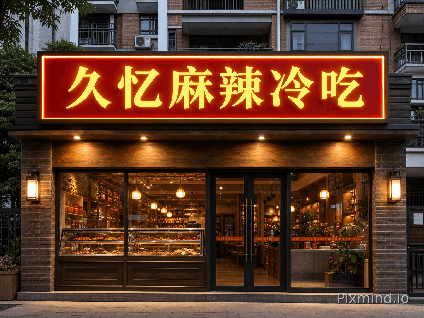
Create a photorealistic Catering storefront facade based on the supplied professional design specifications. SIGNAGE: large rectangular lightbox signage reading exactly "久忆麻辣冷吃", built with acrylic and frontlight. Text must be crisp, centered, correctly spelled, and fully legible. FACADE: brick wall or wood texture facade; red and warm yellow tones palette; luxury aesthetic. ENVIRONMENT: residential neighborhood storefront, community street environment. Street-level front elevation, eye-level perspective, natural architectural proportions. PHYSICAL SIGN SIZE: Design the signboard with realistic proportions for 340 × 125 CM. DESIGN BRIEF: 红色底板,黄色发光字. Photorealistic commercial architectural visualization, accurate materials, natural reflections, realistic shadows, crisp edges, and a buildable sign design. CONSTRAINTS: No watermarks, presentation boards, distorted perspective, decorative captions, or text other than the requested brand wording.

Create a distinctive, portfolio-quality Catering storefront concept from scratch for the brand "久忆麻辣冷吃". Start from brand identity and customer experience, not from a generic signboard template. The result should feel ownable, memorable, commercially credible, and realistically buildable. CREATIVE ROUTE: Create a bold asymmetrical facade composition with purposeful color blocking and a strong visual rhythm between sign, entrance, and windows. BRAND WORDING: Display exactly "久忆麻辣冷吃" as the only prominent wording. Invent a custom typographic voice or logotype treatment suited to the concept. It must remain crisp, correctly spelled, and fully legible. DESIGN SYSTEM: Create one signature visual gesture that a customer would remember. Coordinate the sign, entrance, windows, facade rhythm, color palette, materials, and lighting as one identity. Use intentional hierarchy, layered depth, tactile material transitions, and convincing construction details. AI AUTONOMY: Choose the sign type, facade treatment, palette, materials, and lighting that make this specific brand most distinctive. The category context is warm welcoming design, appetizing atmosphere, commercial dining facade, but reinterpret it rather than copying familiar category clichés. SETTING: busy commercial street. Show a believable complete storefront in context, with the sign and entrance as the visual focus. Use polished commercial architectural photography, a strong but natural composition, and enough surrounding facade to understand the design. CATEGORY CUE: If useful, abstract and reinvent cues related to decorative food icons on signage such as steaming bowl, chopsticks, chef hat, subtle culinary motifs integrated into sign design; never use them as literal stock icons or obvious decoration. DESIGN BRIEF: 红色底板,黄色发光字. Photorealistic commercial architectural visualization, accurate materials, natural reflections, realistic shadows, crisp edges, and a buildable sign design. ANTI-GENERIC CONSTRAINTS: Avoid a plain rectangular lightbox, default 3D letters on a flat panel, stock icons, symmetrical template layouts, random neon, excessive decoration, and interchangeable chain-store styling unless the brief explicitly asks for them. No mockup boards, collages, watermarks, annotations, or text other than the requested brand wording.

Create a distinctive, portfolio-quality commercial retail storefront concept from scratch for the brand "Bena Kahve". Start from brand identity and customer experience, not from a generic signboard template. The result should feel ownable, memorable, commercially credible, and realistically buildable. CREATIVE ROUTE: Use restrained theatrical lighting and layered translucency to create a day-to-night identity that remains elegant when the lights are off. BRAND WORDING: Display exactly "Bena Kahve" as the only prominent wording. Invent a custom typographic voice or logotype treatment suited to the concept. It must remain crisp, correctly spelled, and fully legible. DESIGN SYSTEM: Create one signature visual gesture that a customer would remember. Coordinate the sign, entrance, windows, facade rhythm, color palette, materials, and lighting as one identity. Use intentional hierarchy, layered depth, tactile material transitions, and convincing construction details. AI AUTONOMY: Choose the sign type, facade treatment, palette, materials, and lighting that make this specific brand most distinctive. The category context is modern commercial storefront, but reinterpret it rather than copying familiar category clichés. SETTING: commercial street. Show a believable complete storefront in context, with the sign and entrance as the visual focus. Use polished commercial architectural photography, a strong but natural composition, and enough surrounding facade to understand the design. DESIGN BRIEF: Sade şık görünümlü bena kahve yazısının altında kokusunda mutluluk var sloganı bulunan genç yaşlı her kesime hitap edebilcek bir tabela tasarımı yapmabı istiyorum. Photorealistic commercial architectural visualization, accurate materials, natural reflections, realistic shadows, crisp edges, and a buildable sign design. ANTI-GENERIC CONSTRAINTS: Avoid a plain rectangular lightbox, default 3D letters on a flat panel, stock icons, symmetrical template layouts, random neon, excessive decoration, and interchangeable chain-store styling unless the brief explicitly asks for them. No mockup boards, collages, watermarks, annotations, or text other than the requested brand wording.

Create a distinctive, portfolio-quality Convenience Store storefront concept from scratch for the brand "khayla speed garage". Start from brand identity and customer experience, not from a generic signboard template. The result should feel ownable, memorable, commercially credible, and realistically buildable. CREATIVE ROUTE: Turn the entrance into a recognizable brand portal, using framing, depth, and light to make arrival feel distinctive without changing the building logic. BRAND WORDING: Display exactly "khayla speed garage" as the only prominent wording. Invent a custom typographic voice or logotype treatment suited to the concept. It must remain crisp, correctly spelled, and fully legible. DESIGN SYSTEM: Create one signature visual gesture that a customer would remember. Coordinate the sign, entrance, windows, facade rhythm, color palette, materials, and lighting as one identity. Use intentional hierarchy, layered depth, tactile material transitions, and convincing construction details. AI AUTONOMY: Choose the sign type, facade treatment, palette, materials, and lighting that make this specific brand most distinctive. The category context is bright and highly visible storefront, but reinterpret it rather than copying familiar category clichés. SETTING: street corner or residential area. Show a believable complete storefront in context, with the sign and entrance as the visual focus. Use polished commercial architectural photography, a strong but natural composition, and enough surrounding facade to understand the design. CATEGORY CUE: If useful, abstract and reinvent cues related to friendly basket or cart icon, 24h symbol, simple daily goods pictogram on signage; never use them as literal stock icons or obvious decoration. DESIGN BRIEF: automotif. Photorealistic commercial architectural visualization, accurate materials, natural reflections, realistic shadows, crisp edges, and a buildable sign design. ANTI-GENERIC CONSTRAINTS: Avoid a plain rectangular lightbox, default 3D letters on a flat panel, stock icons, symmetrical template layouts, random neon, excessive decoration, and interchangeable chain-store styling unless the brief explicitly asks for them. No mockup boards, collages, watermarks, annotations, or text other than the requested brand wording.

Create a distinctive, portfolio-quality Coffee Shop storefront concept from scratch for the brand "GREY MATTER". Start from brand identity and customer experience, not from a generic signboard template. The result should feel ownable, memorable, commercially credible, and realistically buildable. CREATIVE ROUTE: Create a sculptural signage system integrated into the architecture, using layered depth, shadow gaps, and one memorable three-dimensional gesture. BRAND WORDING: Display exactly "GREY MATTER" as the only prominent wording. Invent a custom typographic voice or logotype treatment suited to the concept. It must remain crisp, correctly spelled, and fully legible. DESIGN SYSTEM: Create one signature visual gesture that a customer would remember. Coordinate the sign, entrance, windows, facade rhythm, color palette, materials, and lighting as one identity. Use intentional hierarchy, layered depth, tactile material transitions, and convincing construction details. AI AUTONOMY: Choose the sign type, facade treatment, palette, materials, and lighting that make this specific brand most distinctive. The category context is warm contemporary cafe, crafted and welcoming street presence, but reinterpret it rather than copying familiar category clichés. SETTING: walkable urban commercial street. Show a believable complete storefront in context, with the sign and entrance as the visual focus. Use polished commercial architectural photography, a strong but natural composition, and enough surrounding facade to understand the design. CATEGORY CUE: If useful, abstract and reinvent cues related to minimal coffee bean or cup motif used as a small brand accent; never use them as literal stock icons or obvious decoration. DESIGN BRIEF: minimalist black colour title on grey background. Photorealistic commercial architectural visualization, accurate materials, natural reflections, realistic shadows, crisp edges, and a buildable sign design. ANTI-GENERIC CONSTRAINTS: Avoid a plain rectangular lightbox, default 3D letters on a flat panel, stock icons, symmetrical template layouts, random neon, excessive decoration, and interchangeable chain-store styling unless the brief explicitly asks for them. No mockup boards, collages, watermarks, annotations, or text other than the requested brand wording.

Create a distinctive, portfolio-quality commercial retail storefront concept from scratch for the brand "INtRO". Start from brand identity and customer experience, not from a generic signboard template. The result should feel ownable, memorable, commercially credible, and realistically buildable. CREATIVE ROUTE: Design a graphic facade system where typography, a simple custom motif, and architectural lines work together as one coherent identity. BRAND WORDING: Display exactly "INtRO" as the only prominent wording. Invent a custom typographic voice or logotype treatment suited to the concept. It must remain crisp, correctly spelled, and fully legible. DESIGN SYSTEM: Create one signature visual gesture that a customer would remember. Coordinate the sign, entrance, windows, facade rhythm, color palette, materials, and lighting as one identity. Use intentional hierarchy, layered depth, tactile material transitions, and convincing construction details. AI AUTONOMY: Choose the sign type, facade treatment, palette, materials, and lighting that make this specific brand most distinctive. The category context is modern commercial storefront, but reinterpret it rather than copying familiar category clichés. SETTING: commercial street. Show a believable complete storefront in context, with the sign and entrance as the visual focus. Use polished commercial architectural photography, a strong but natural composition, and enough surrounding facade to understand the design. Photorealistic commercial architectural visualization, accurate materials, natural reflections, realistic shadows, crisp edges, and a buildable sign design. ANTI-GENERIC CONSTRAINTS: Avoid a plain rectangular lightbox, default 3D letters on a flat panel, stock icons, symmetrical template layouts, random neon, excessive decoration, and interchangeable chain-store styling unless the brief explicitly asks for them. No mockup boards, collages, watermarks, annotations, or text other than the requested brand wording.
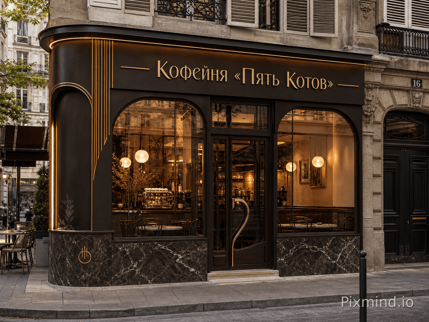
Create a distinctive, portfolio-quality Coffee Shop storefront concept from scratch for the brand "Кофейня «Пять Котов»". Start from brand identity and customer experience, not from a generic signboard template. The result should feel ownable, memorable, commercially credible, and realistically buildable. CREATIVE ROUTE: Reinterpret a relevant local or category cue in an abstract contemporary way; avoid literal clip-art and obvious themed decoration. BRAND WORDING: Display exactly "Кофейня «Пять Котов»" as the only prominent wording. Invent a custom typographic voice or logotype treatment suited to the concept. It must remain crisp, correctly spelled, and fully legible. DESIGN SYSTEM: Create one signature visual gesture that a customer would remember. Coordinate the sign, entrance, windows, facade rhythm, color palette, materials, and lighting as one identity. Use intentional hierarchy, layered depth, tactile material transitions, and convincing construction details. AI AUTONOMY: Choose the sign type, facade treatment, palette, materials, and lighting that make this specific brand most distinctive. The category context is warm contemporary cafe, crafted and welcoming street presence, but reinterpret it rather than copying familiar category clichés. SETTING: walkable urban commercial street. Show a believable complete storefront in context, with the sign and entrance as the visual focus. Use polished commercial architectural photography, a strong but natural composition, and enough surrounding facade to understand the design. CATEGORY CUE: If useful, abstract and reinvent cues related to minimal coffee bean or cup motif used as a small brand accent; never use them as literal stock icons or obvious decoration. DESIGN BRIEF: French cafe, early 1920s. Photorealistic commercial architectural visualization, accurate materials, natural reflections, realistic shadows, crisp edges, and a buildable sign design. ANTI-GENERIC CONSTRAINTS: Avoid a plain rectangular lightbox, default 3D letters on a flat panel, stock icons, symmetrical template layouts, random neon, excessive decoration, and interchangeable chain-store styling unless the brief explicitly asks for them. No mockup boards, collages, watermarks, annotations, or text other than the requested brand wording.

EDIT the supplied original commercial retail storefront photograph. This is an architectural photo edit, not a new storefront concept. Image 1 is the original storefront photograph whose geometry must be preserved. Image 2 is the exact brand logo reference. PRESERVE: Keep the original camera position, perspective, crop, building outline, floor levels, entrance location, doors, windows, columns, neighboring context, and overall scene geometry unchanged. SCOPE: Modify only the existing signboard area. Keep the facade finish, doors, windows, pavement, neighboring shops, and surroundings unchanged. SIGNAGE: Remove the old sign wording and replace it with exactly "小爱健身房". The replacement text must be crisp, centered, correctly spelled, and fully legible. Use a horizontal signage panel, 3D illuminated letters, and LED lighting. DESIGN: modern commercial storefront; match the dominant color tones from the reference image palette; modern facade. DESIGN BRIEF: 门头淡绿色,门头材质要亚克力. Photorealistic commercial architectural visualization, accurate materials, natural reflections, realistic shadows, crisp edges, and a buildable sign design. CONSTRAINTS: Do not create a different building or move architectural openings. No mockup frames, before-and-after collage, watermarks, annotations, measurements, or unrelated text.