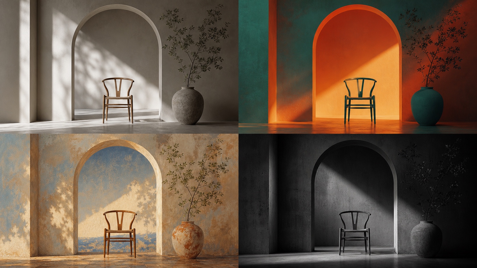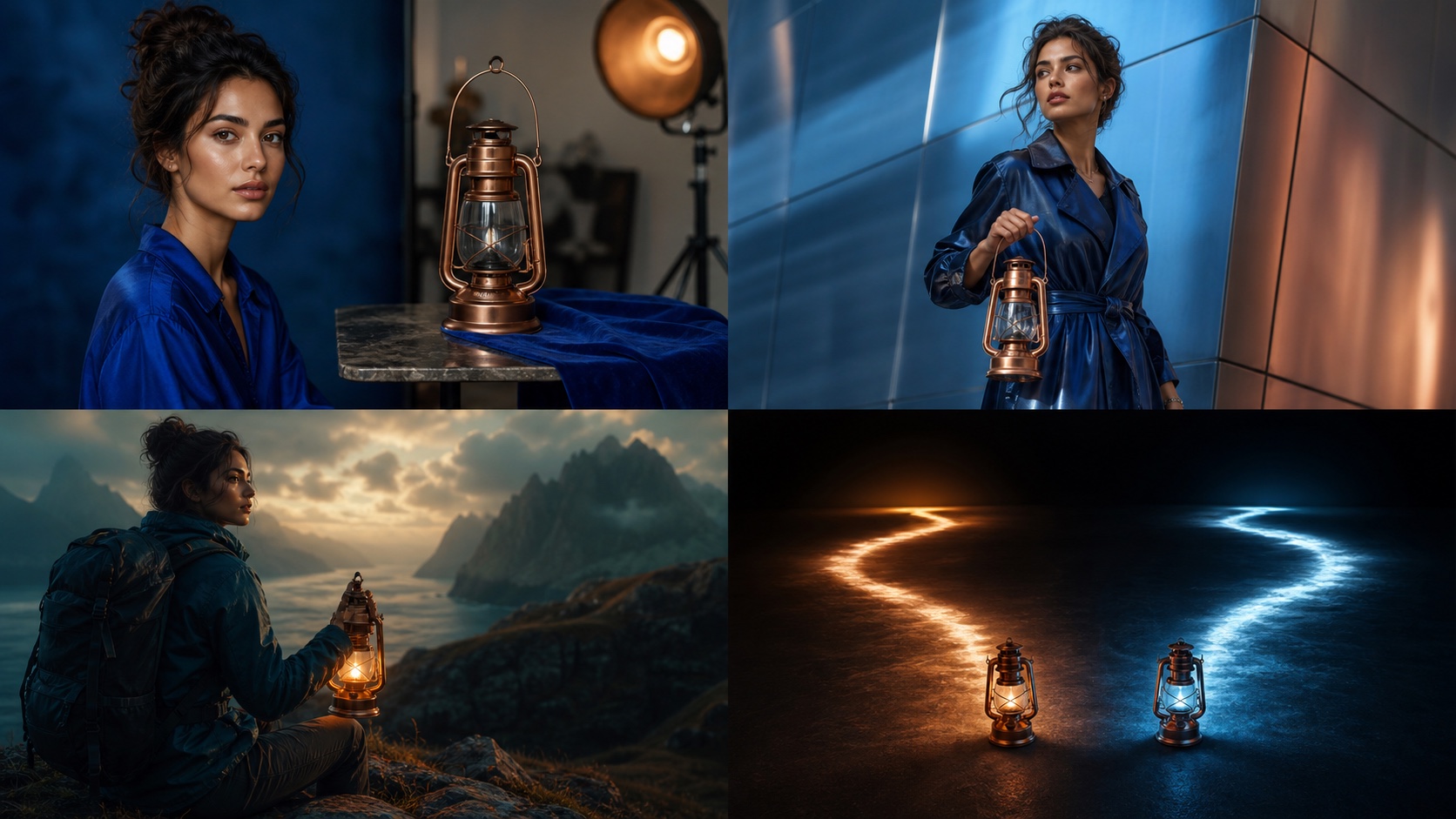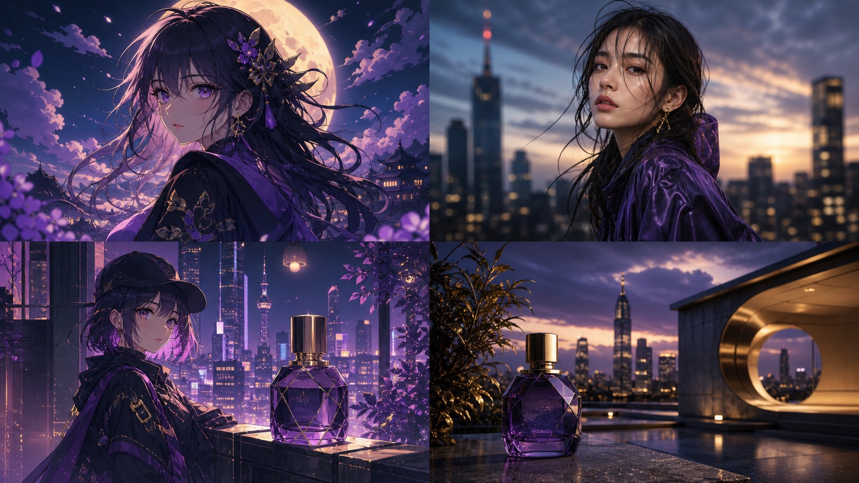
Midjourney V8.1 moodboards (--p) are personalization profiles built from selected images that influence the overall aesthetic of generated images [S4]. Unlike style references (--sref), which carry overall visual properties, moodboards are designed to capture a broader artistic direction. They are particularly useful for establishing a consistent look and feel across multiple images in a campaign.
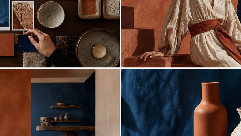
Moodboard vs SREF vs personalization
Understanding the distinct roles of moodboards, style references, and personalization is crucial for effective Midjourney V8.1 image generation. While all three aim to guide the AI's output, they operate at different levels of specificity and have different compatibilities.
- Moodboards (
--p): These are personalization profiles created from a collection of images. They influence the overall aesthetic, mood, and thematic elements of your generations. Think of them as a high-level artistic brief. Moodboards can be combined and their strength adjusted with--stylize[S4]. - Style Reference (
--sref): This parameter carries specific visual properties like color palettes, textures, lighting, and artistic styles from one or more reference images. It's more granular than a moodboard and is ideal for replicating a particular visual signature. Style references support versions 6 and later, and their strength can be adjusted with--sw[S5]. - Personalization (
--personalize): This parameter allows you to train Midjourney on your preferred aesthetic over time, creating a unique "personalization profile" that influences all your generations. While related to moodboards,--personalizeis a broader, account-level setting rather than a per-prompt parameter [S2].
Here's a quick comparison of their primary uses and compatibilities:
| Feature | Moodboard (--p) |
Style Reference (--sref) |
Omni Reference (--oref) |
|---|---|---|---|
| Primary Use | Overall aesthetic, mood, thematic direction | Specific visual properties (color, texture, lighting) | Carry people, objects, vehicles, non-human creatures |
| Input | Multiple image URLs (or codes) | Multiple image URLs (or codes) | Single image URL (or code) |
| Strength Control | --stylize (0-1000) |
--sw (0-1000) |
--ow (1-1000) |
| Compatibility | V8.1, V8.2, V7 | V8.1, V8.2, V7, V6 | V7 only (automatically uses V7) |
| Incompatibilities | --sv, --sw [S4] |
Moodboards (--p) [S5] |
Fast, Draft, Conversational Mode, q4, Vary Region, Pan, Zoom Out [S3] |
| GPU Cost | Standard | Standard | Twice regular V7 GPU time [S3] |
How to build a useful V8.1 moodboard
Building an effective V8.1 moodboard involves selecting images that collectively convey your desired aesthetic. The goal is to provide Midjourney with a clear visual brief that it can interpret and apply to new generations.
-
Curate your images: Select 3-5 images that embody the mood, color palette, lighting, and general style you want. These images should be diverse enough to cover different aspects of your desired aesthetic but cohesive enough to form a unified vision.
-
Upload and get codes: Upload your chosen images to Midjourney (or any public image host) to get their URLs. If using Midjourney, upload them in a private chat or server, then copy the image links.
-
Construct the moodboard prompt: Use the
--pparameter followed by the URLs of your selected images. You can combine multiple image URLs./imagine prompt a serene forest at dawn --p [URL1] [URL2] [URL3] -
Refine with text prompts: Your text prompt should describe the content you want, while the moodboard guides the style. Be specific with your content descriptions.
/imagine prompt a futuristic city skyline at sunset, neon glow, bustling streets, flying vehicles --p https://s.mj.run/abc.png https://s.mj.run/def.png --v 8.1 -
Iterate and adjust: Generate a few images and assess how well the moodboard is being interpreted. If the results aren't quite right, consider:
- Adding or removing images from your moodboard.
- Adjusting the
--stylizeparameter (see next section). - Refining your text prompt for greater clarity.
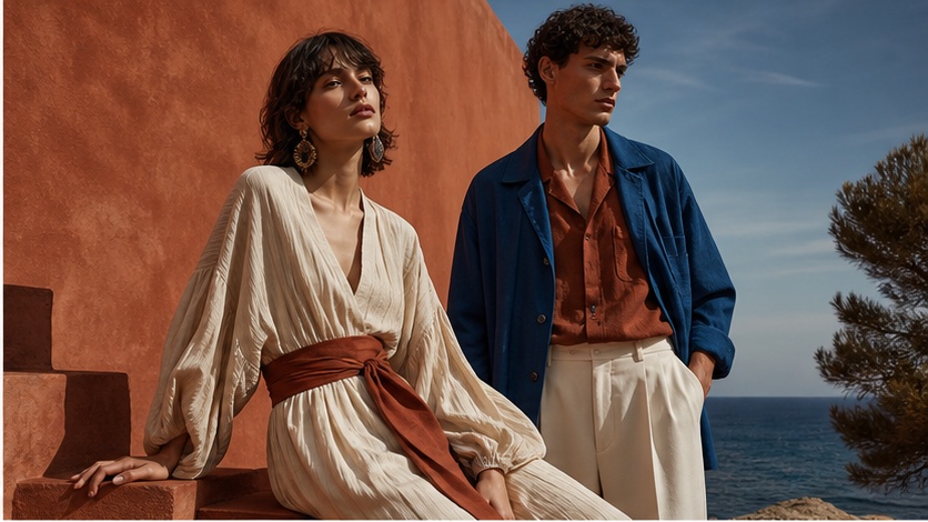
How stylize changes moodboard strength
The --stylize parameter controls how strongly Midjourney's default aesthetic influences your image, ranging from 0 to 1000 [S2]. When used with a moodboard (--p), --stylize dictates how much the AI adheres to its own artistic interpretation versus the visual cues provided by your moodboard [S4].
--stylize 0: The AI will try to adhere very closely to the moodboard's aesthetic, potentially sacrificing some artistic flair or coherence if the moodboard images are too disparate. This setting emphasizes the moodboard's influence.--stylize 100(default): A balanced approach where the moodboard's influence is present but Midjourney still applies its own artistic understanding to create a coherent image.--stylize 1000: The AI will lean heavily on its default aesthetic, with the moodboard acting more as a subtle suggestion. This can be useful if your moodboard is very abstract or you want Midjourney to have more creative freedom while still being guided by your chosen theme.
Practical Application:
Start with --stylize 100 (the default) when using a moodboard. If the results are too generic, try lowering --stylize to 50 or even 0 to give the moodboard more weight. If the results are too literal or lack artistic polish, increase --stylize to 250 or higher.
/imagine prompt a whimsical treehouse in a magical forest --p https://s.mj.run/abc.png --stylize 50 --v 8.1
A five-image campaign consistency workflow
Achieving visual consistency across a series of images, like for a marketing campaign, requires a structured approach. This workflow leverages Midjourney V8.1's features to maintain a cohesive aesthetic.
-
Define your core aesthetic: Before generating, clearly articulate the desired mood, color palette, lighting, and overall style. Gather 3-5 strong reference images that embody this aesthetic. These will form your primary moodboard.
-
Create your base moodboard: Upload your chosen reference images and construct your initial moodboard prompt. Experiment with
--stylizeto find the sweet spot where the moodboard's influence is strong but the images remain high quality./imagine prompt [your core concept], cinematic lighting, vibrant colors --p [URL1] [URL2] [URL3] --stylize 75 --v 8.1 -
Generate initial key visuals: Create 2-3 key images that represent different aspects of your campaign. These will serve as additional style references for subsequent generations. Select the best one or two to use as your campaign's "master" style references.
-
Combine moodboard and master SREF: For subsequent images in your campaign, use your established moodboard (
--p) and one or two of your best generated key visuals as style references (--sref). This dual approach provides both the broad aesthetic guidance of the moodboard and the specific visual properties from your master images. Remember,--pand--srefare compatible in V8.1./imagine prompt a character exploring ancient ruins, dramatic shadows --p [MoodboardURL1] [MoodboardURL2] --sref [MasterSREF_URL1] --sw 150 --stylize 75 --v 8.1Note: While
--pand--srefcan be used together,--sw(style weight) and--sv(style reference version) are not compatible with moodboards [S4, S5]. -
Iterate and refine for each image: For each new image in the campaign, adjust the text prompt to describe the specific content, but keep the moodboard and master style references consistent. Make minor tweaks to
--stylizeor--swif needed, but prioritize consistency.
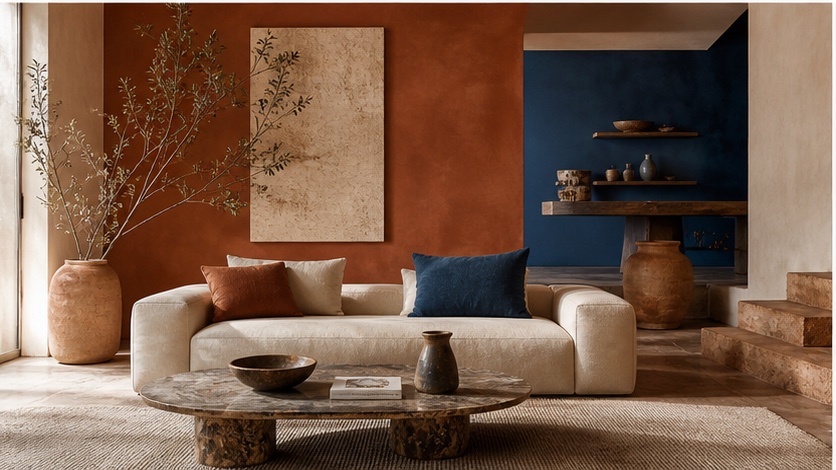
Compatibility limits and common mistakes
Midjourney V8.1 offers powerful tools, but understanding its limitations and avoiding common pitfalls is key to successful image generation.
Compatibility Table (V8.1 Specifics)
| Feature | V8.1 Compatibility | Notes ### Common Mistakes
- Overloading references: Using too many moodboard images or combining
--pwith too many--srefimages can dilute their individual impact, leading to inconsistent or muddled results. Start with fewer, stronger references. - Confusing
--srefand--oref: Remember that--srefcarries style, while--orefcarries objects/characters and automatically forces V7 [S3, S5]. Do not use--orefif you need V8.1 features. - Ignoring
--stylizeand--sw: These parameters are crucial for fine-tuning the influence of your moodboards and style references. Not adjusting them can lead to results that are either too generic or too literal. - Incompatible parameters: Always check the documentation for parameter compatibility. For instance,
--swand--svare not compatible with moodboards [S4, S5]. Using incompatible parameters will either be ignored or result in unexpected behavior. - Poor quality reference images: Low-resolution, poorly composed, or visually noisy reference images will negatively impact the quality and fidelity of your generations. Use high-quality, clear images for your moodboards and style references.
- Not using V8.1 explicitly: While V8.2 is the current default, if you specifically want V8.1's behavior (e.g., its native HD output [S1]), you must explicitly add
--v 8.1to your prompt.
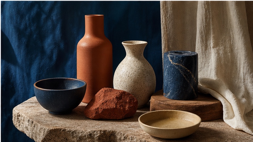
When one reference image is enough
While moodboards are excellent for broad aesthetic guidance, there are scenarios where a single, well-chosen reference image is sufficient, or even preferable.
-
Specific style replication: If you need to replicate a very particular artistic style, color palette, or lighting from a single, strong example,
--srefwith just one image can be highly effective. This is especially true if the reference image perfectly encapsulates the desired look./imagine prompt a portrait of a wise old wizard, intricate details --sref https://s.mj.run/wizard_style.png --sw 200 --v 8.1 -
Character or object consistency: When you need to maintain the visual identity of a specific character or object across multiple scenes, a single
--oref(Omni Reference) image is the tool for the job. Remember,--orefautomatically uses V7 and is incompatible with V8.1 [S3]. If you need V8.1 features, you'll have to rely on strong text prompts and potentially--sreffor style, but not for carrying the exact character/object./imagine prompt a futuristic robot exploring a desert planet --oref https://s.mj.run/robot_design.png --v 7 -
Minimalist aesthetic: For projects requiring a very clean, minimalist, or abstract style, a single reference image that exemplifies this simplicity can be more effective than a complex moodboard, which might introduce unwanted visual noise.
/imagine prompt abstract geometric shapes, pastel colors, minimalist design --sref https://s.mj.run/minimal_art.png --sw 100 --v 8.1 -
Quick experimentation: When you're rapidly iterating and testing different styles, using a single
--srefimage allows for quicker adjustments and clearer understanding of its impact compared to managing a multi-image moodboard.
In these cases, the clarity and directness of a single reference can outweigh the broader influence of a moodboard, leading to more predictable and controlled results.
Frequently Asked Questions
Can I use --p and --sref together in Midjourney V8.1?
Yes, you can use --p (moodboard) and --sref (style reference) together in Midjourney V8.1. The moodboard will provide a general aesthetic direction, while the style reference will contribute more specific visual properties like color and texture. However, note that --sw (style weight) and --sv (style reference version) are not compatible with moodboards [S4, S5].
What is the difference between --stylize and --sw?
--stylize controls how much Midjourney's default aesthetic influences your image when using a moodboard (--p) [S4]. --sw (style weight) controls the strength of a style reference (--sref) [S5]. They serve similar functions but apply to different reference types.
Why would I use V8.1 instead of the default V8.2?
Midjourney V8.2 is the current default version [S1]. However, you might choose V8.1 if you prefer its specific visual characteristics, particularly its native HD output (2048px) for initial generations, which is not available in V8.2 [S1]. If your existing production pipeline relies on V8.1's established behavior, explicitly using --v 8.1 ensures consistency.